*Editor’s note: The number of global Hallyu (Korean Wave) fans is approaching approximately 225 million, according to the 2024 report by the Korea Foundation. The surge in fans marks the dawn of the "Digital Silk Road" era, where communication transcends the limitations of time and space, enabling real-time interaction across the globe. Truly, we are in the era of "Hallyu 4.0."
Suk Soo-sun's Design Management Story: Successful Cases of City Branding
Contributed by Suk Soo-sun (professor at Yonsei Graduate School of Communication & Arts)

◇ Global Iconic Image: New York, USA
New York is one of the most symbolic cities in the world, with its branding built upon a unique identity and appeal. The city's brand encompasses freedom, diversity, creativity, and dynamism, positioning it as a land of opportunity open to all.
In 1977, renowned graphic designer Milton Glaser (1929–2020) created the iconic "I ♥ NY" logo, significantly altering public perception of New York. This design emerged during the economic downturn of the 1970s, when the global economy was struggling due to the first oil crisis.
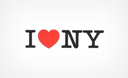 |
| ▲ New York City icon advertisement designed by Milton Glaser, captured from Wikitree. (PHOTO NOT FOR SALE) (Yonhap) |
At that time, the New York Department of Commerce initiated an advertising campaign to inspire hope among residents. This effort aimed to differentiate New York from other cities amid urban decline, high crime rates, and economic hardships.
The I Love New York campaign proved to be a tremendous success. Just one year after its launch, the city's tourism revenue increased by $140 million. Encouraged by these results, New York State doubled its advertising budget, extending the campaign for a decade. This initiative helped restore the city's positive image and foster a renewed sense of appreciation among both residents and tourists.
Following the 9/11 attacks, Milton Glaser adapted his original logo by adding a darkened, smoke-stained effect to the lower-left side of the heart symbol in remembrance of the World Trade Center. He formally requested the city to adopt this redesigned version for official use, but the proposal was ultimately declined. However, the altered logo gained traction among the public as newspapers circulated it widely.
The I ♥ NY logo became explosively popular on merchandise, particularly T-shirts. Although many of these products were produced without proper licensing, their widespread replication solidified the logo’s place as an enduring symbol of New York City rather than just New York State.
◇ Harmony of Tradition and Modernity: Porto, Portugal
Porto, the second-largest city in Portugal, boasts a unique blend of history and culture. To establish a strong global city image, Porto collaborated with designer Eduardo Aires. Aires aimed to create a visual identity that would streamline communication between the city and its residents while defining a clear hierarchy that integrated both the city and its administration under a unified brand.
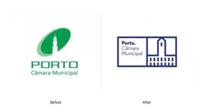 |
| ▲ Before and after images of Porto’s design, captured from Eduardo Aires' website. (PHOTO NOT FOR SALE) (Yonhap) |
One of Porto’s most distinctive architectural features is its vibrant blue-tiled façades, which span different historical periods. Inspired by these traditional tiles, Aires sought to preserve Porto’s historical identity while infusing it with modern values. This approach allowed the city to maintain its heritage while embracing a contemporary aesthetic.
Understanding diversity as the essence of Porto, Aires developed over 70 geometric icons representing the city and its people. These icons were designed on a grid-based system, reminiscent of tile panels, creating a continuous and interconnected visual network.
Each icon serves as a visual code that captures the complexity of the city, maintaining individual significance while forming a cohesive identity. New icons can be added to the system as needed, while older ones can be retired, ensuring that the design remains dynamic and reflective of Porto’s evolving character. The ultimate goal was for this visual language to function as a mirror of the city itself.
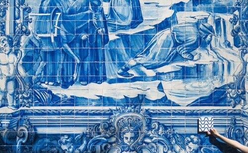 |
| ▲ Porto’s Blue Tiles, captured from Eduardo Aires' website. (PHOTO NOT FOR SALE) (Yonhap) |
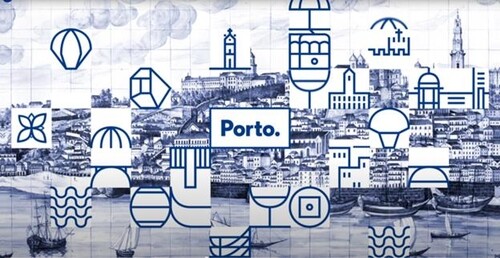 |
| ▲ Newly designed Blue Tiles of Porto, captured from Eduardo Aires' website. (PHOTO NOT FOR SALE) (Yonhap) |
By blending traditional craftsmanship with modern simplicity, Porto’s branding became one of its most influential symbols. The process actively involved citizens, encouraging participation and the continuous introduction of new icons.
A well-crafted and meaningful design naturally spreads among both residents and tourists. Over time, these shared visual elements become embedded as a city’s brand identity. The first impression a design evokes directly influences an individual’s immediate perception, making this an essential aspect of city branding.
(C) Yonhap News Agency. All Rights Reserved